http://www.designfruit.com/dfassets/images/tasty_tattoo_03.jpg
http://www.tattoosfromthesoul.com/images/beautiful-asian-girl-tattoo.jpg
Is it interesting??? Can you recognize that is one type of Line Art?
Though the colours are only black and white, but they are mixed properly....So it makes them look very good. They gave me a strong inspiration about Rock - a type of music that I liked very much
Tattoo is very popular in nowadays, it is the way to make your body attractive and more sexy.
That's true, but don't overuse it...Applying too many tattoos to yuor body will bring
some negative effects to your skin
If you can see that tattoos are huge of types, I tried use some tattoos in my poster and they were effective for the frame and border... Why don't you try once?
Sunday, March 25, 2007
Color
http://www.acm.org/crossroads/xrds3-3/gfx/color.jpg
I am so interested in this image that is a good example of using color and illustration.
This image gives me a strong feeling about the border of kindness and cruelty of a person, becoming which depends on themselves (my own opinion).
Besides, that is perfect in the use of light that make the viewer focus on center of the image.
My inspiration about it is some scenes from the song "Frozen" by Madonna.
There is enough negative space that emphasize two opposite view.
Sunday, March 18, 2007
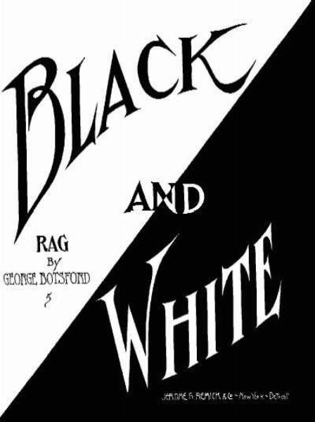
Black and White
http://www.ragtime-society.de/Video/04-Black%20And%20White.jpg
What is it??? It is a music cover. I am so interested in the use of the text and the way of arrangement.
Positive and Negative, Black and White and the mix of black and white make it balance.
Is it look like a face??? A face white two opposite things and charateristics, happiness and sadness...
Somehow, it also look like an eye that contain all human motion.
However, the text in the black area at the right corner is still hard to read (small text). What does it say???
Collage
http://www.tate.org.uk/collection/L/L02/L02117_9.jpg
This image makes me feel about a city that is viewed on the plane. Besides, the use of text and shape are really strange and hard to understand. In fact, it reminds me about puzzles and magic...
Moreover, the use of black and white that punch out the word MEN so imazing. And we still see that there are a man (cowboy) after the curtain make by an arrow of text that point to a street that access to the city. How about you? What can you see?
Sunday, March 11, 2007
Business Etiquette Design 2
This is the new one. I went to BUI THI XUAN street and found a collection of art. Then I pick one of them to make this poster. I wish that I could draw like this but...
In this poster, there are still black, white, gray and red but the white colour take most place.
"A meeting" remind me about PARTY where everybody sees each other, gives name card and drinks wine/beer.
I put the word "A key to success" in side the word "Etiquette" to make emphasize the important of business communication.
"Japaness Business" points to face --> How you talk /eat/looking.
"Dress and Make Up" points to chair --> How you sit/dress.
"Business Etiquette in Europe" points to legs --> How you walk/stand
3 points combine together will be <Etiquette>
What is your opinion???
Business Etiquette Design 1
I made this poster for business club as a request of my friend. But I am not sure they will choose it for their event...^_^ but i would like to share my experience with everyone.
I used elements of design to make it: dominance and subordination, coherence, positive and negative.
Black, white, gray and red are those colours that I chose for the poster. It presents the formality and luxury of the event.
My inspiration came from the word " ETIQUETTE " and my view on the business enterprise. Business man and woman are genius and active.
But this is the first time I make a poster. So what do you think about it? Will you have something to recommend me to make it better???
Sunday, March 04, 2007
World of Woman
http://www.allnations.ukc.biz/nail_art_images/frontlogo.jpg
Is it interesting? Have you ever seen a hand with colorful nails with different images??? Lovely, imazing and clever are words to decribe about the person who makes nails.
This is the world of nail design which only be used for woman. We can see different colors, shapes, ideas...on NAILs.
This is the new model for woman who want to make up themselves. There a lots of symbol and colorful dyes to pain on nails.
Moreover, there are some plastic nails that used for changing style without damaging. Many many nail shops are opened in Vietnam and overseas that create a lots of job and money. In fact, there are about 57800 nail shops in America...so amazing!!! And design nail become familiar that huge catalogues are released for users to make up their hand...
However, you must be practise many many time to have a beautiful nail or you will damage your nails. You can easily find some nail shop at Ben Thanh market or on Nguyen Thi Thap street....
My Icon
This is the my icon. It represents my characteristics and my motion:
--> A shield means defence, alone and silent.
You can see the "H" letter on the top, that is my name Hoang.
Moreover, "T" means "TRY". I am trying my best to graduate in the design program of RMIT Uni.
"K" means knowleadge, I rather want to learn more skills than marks.
Finally, it is also a bullet that points to my target: Design + RMIT = Graduation.
Subscribe to:
Posts (Atom)